Case study
Vinotok
A living folklore, shaped into a seasonal visual language.
Creative Direction · Art Direction · Photography · Organic Social
Across six years, I led seasonal creative and photography for Crested Butte's community harvest celebration—translating its evolving mythology into a distinct visual language across portraits, event imagery, environmental storytelling, and organic social.
Overview
Vinotok is a community-created celebration rooted in Crested Butte's mining history, environmental stewardship, harvest traditions, and fierce sense of place.
Across six years, I led seasonal creative and photography for the celebration—translating its evolving mythology into a distinct visual language across portraits, event imagery, environmental storytelling, and organic social.
The challenge was unusual: build recognition and engagement without turning an intimate cultural tradition into a commercial spectacle.
Creative Strategy
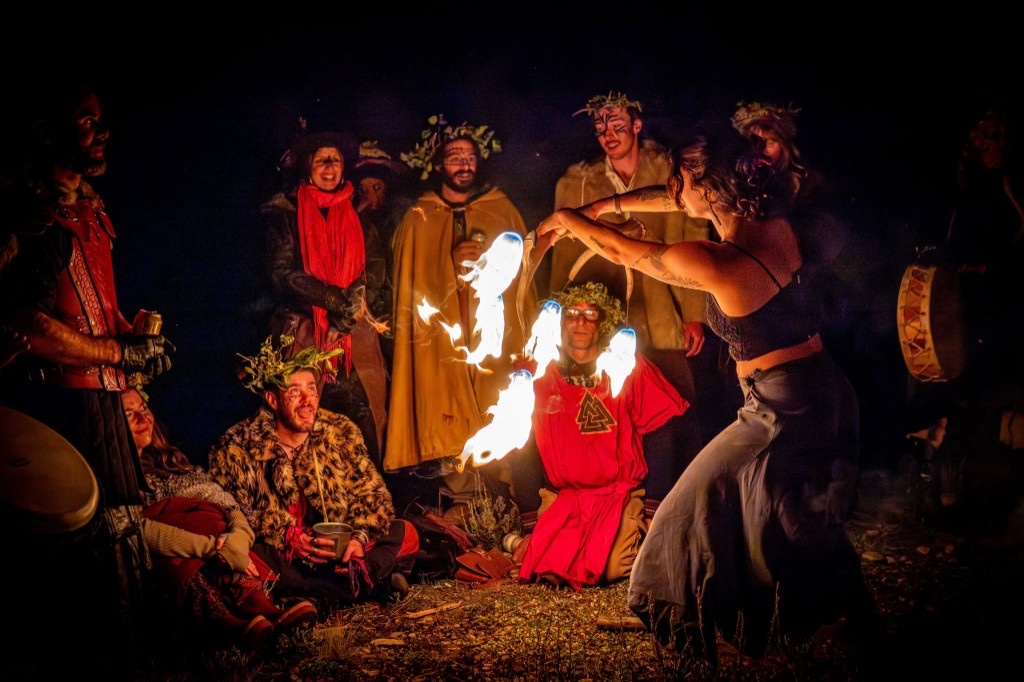
Vinotok belongs first to the community that creates it. Its identity lives in handmade costumes, archetypal characters, fire, performance, local history, and the surrounding landscape.
Rather than impose an external campaign aesthetic, I built the creative direction from those existing visual codes. Each season began with the narrative, characters, locations, performances, and community priorities. From there, I developed shot plans and visual direction that established consistency while leaving room for the unpredictable moments at the heart of the experience.
The result was a seasonal framework that remained recognizable across years without making a living tradition feel fixed or overproduced.
Visual Direction
Fire. Earth. Movement. Transformation.
The image language balanced theatrical scale with human intimacy: ceremonial figures against the mountain landscape, firelit performances, handmade details, environmental textures, and quiet moments surrounding the public ritual.
I approached the work as a participant rather than an outside observer. That proximity produced images that felt cinematic without losing their credibility—revealing both the mythology and the people responsible for keeping it alive.
Role
I led the visual process from early planning through final delivery:
- Seasonal concept and visual direction
- Pre-production and shot planning
- Location and performance photography
- Portraiture and character documentation
- On-site art direction
- Image selection and post-production
- Organic social content and sequencing
- Stewardship of the long-term image archive
Brand Stewardship
For a community tradition, authenticity cannot be manufactured. It has to be earned.
Working across multiple seasons allowed me to build trust, anticipate significant moments, and distinguish between an image that was simply dramatic and one that genuinely represented the experience.
The photography became more than event documentation. It functioned as a flexible brand system: a coherent body of imagery that could support seasonal storytelling, social communications, community engagement, and Vinotok's historical record.
Impact
The work gave Vinotok a distinctive and consistent visual presence across six seasons while preserving the handmade, community-led character at the center of the celebration.
Seasonal storytelling, event photography, and organic social helped grow the audience to approximately 5,100 followers during the final two years of my engagement—without relying on a conventional promotional model.
Most importantly, the work created a visual legacy for a tradition built around participation, memory, and place.
Reflection
Vinotok reinforced a principle that guides my brand work: the strongest visual systems are discovered within the experience, not applied on top of it.
My role was to listen closely, identify the most meaningful visual codes, and shape them into a clear and recognizable language without sanding away their complexity.
That balance—between consistency and flexibility, strategy and instinct, stewardship and creative distinction—is what allows a brand to become memorable while remaining credible to the people it represents.
Closing statement